Ten55 Brewing Company
Small Batch, Big Presence
Services
Branding, Identity, Label Design
Industry
Beverage
Services
Identity, Label Design, Print
Industry
Beverage
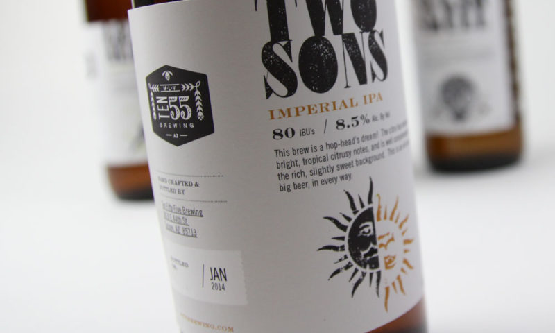
The name 1055 pays homage to the brewmaster's late brother. The concept of the holly wreath and hops is a marriage of everlasting life and beer (of course). As a start up company 1055 quickly adopted a grassroots, DIY mentality which is represented in a clean usage of typography and textures. This timeless treatment created a baseline for the company to have their own unique personality in an already saturated space.
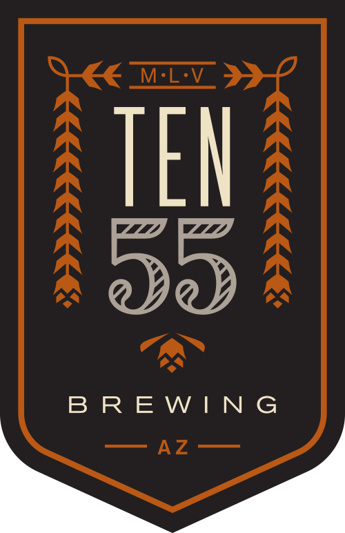
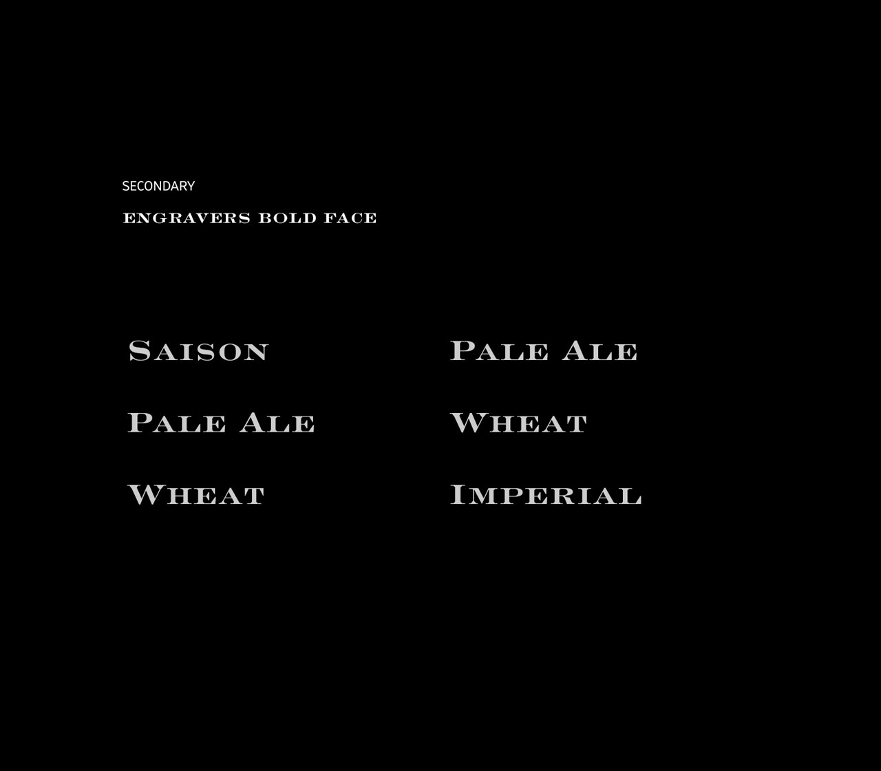
Establishing brand elements by defining typography, flaghship color palette and texure to showcase the brands personality.
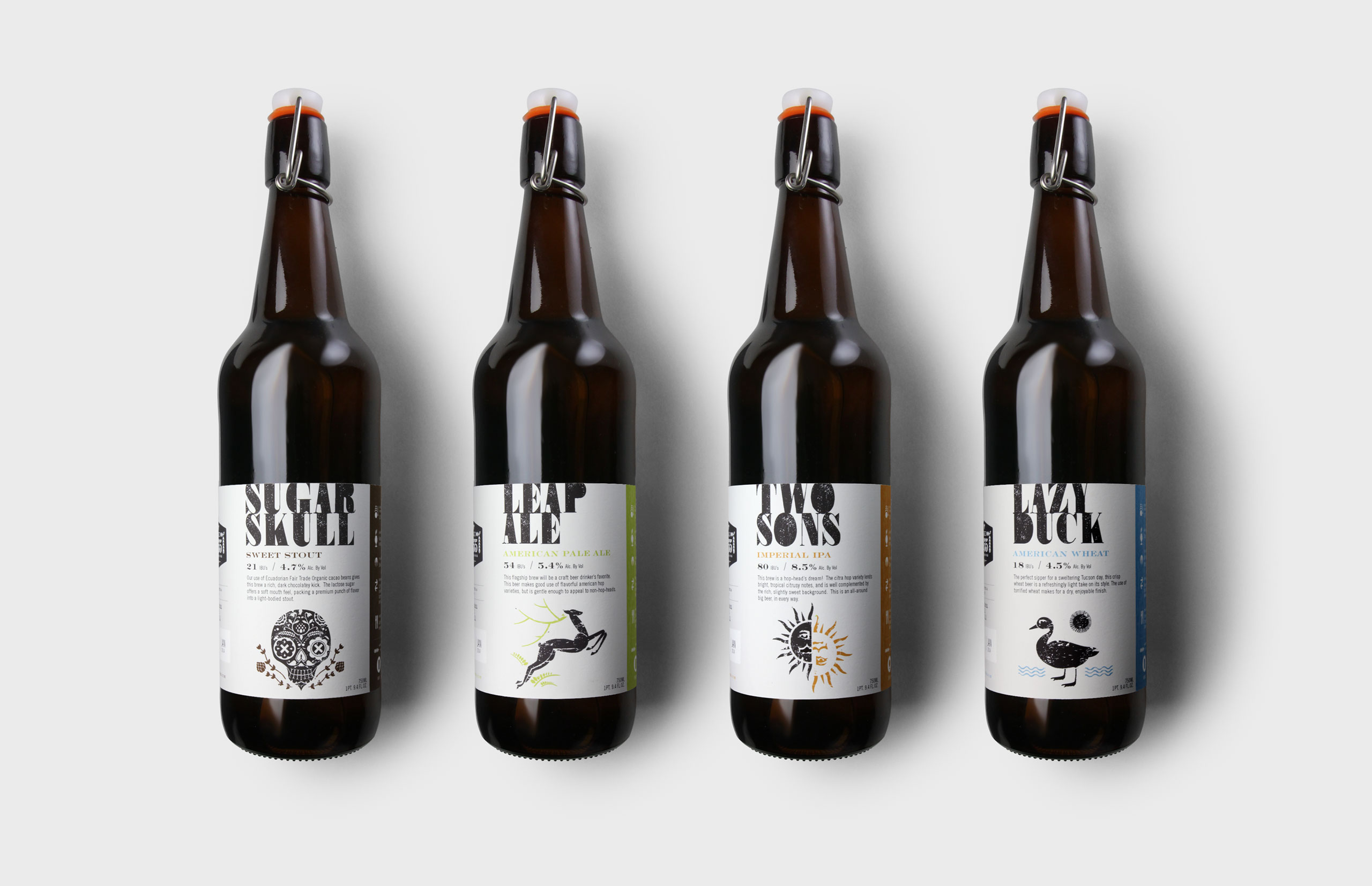
Label Design
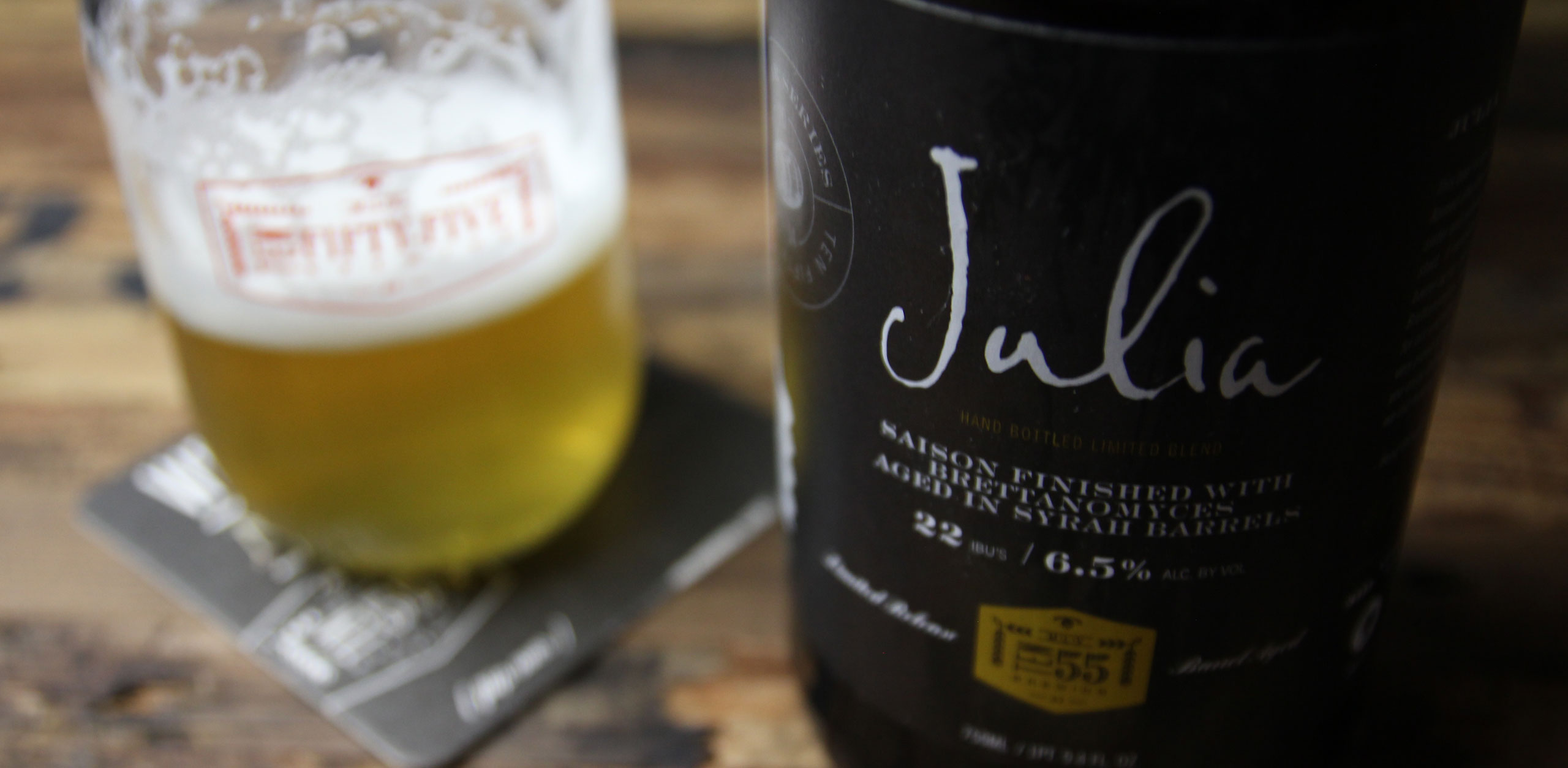
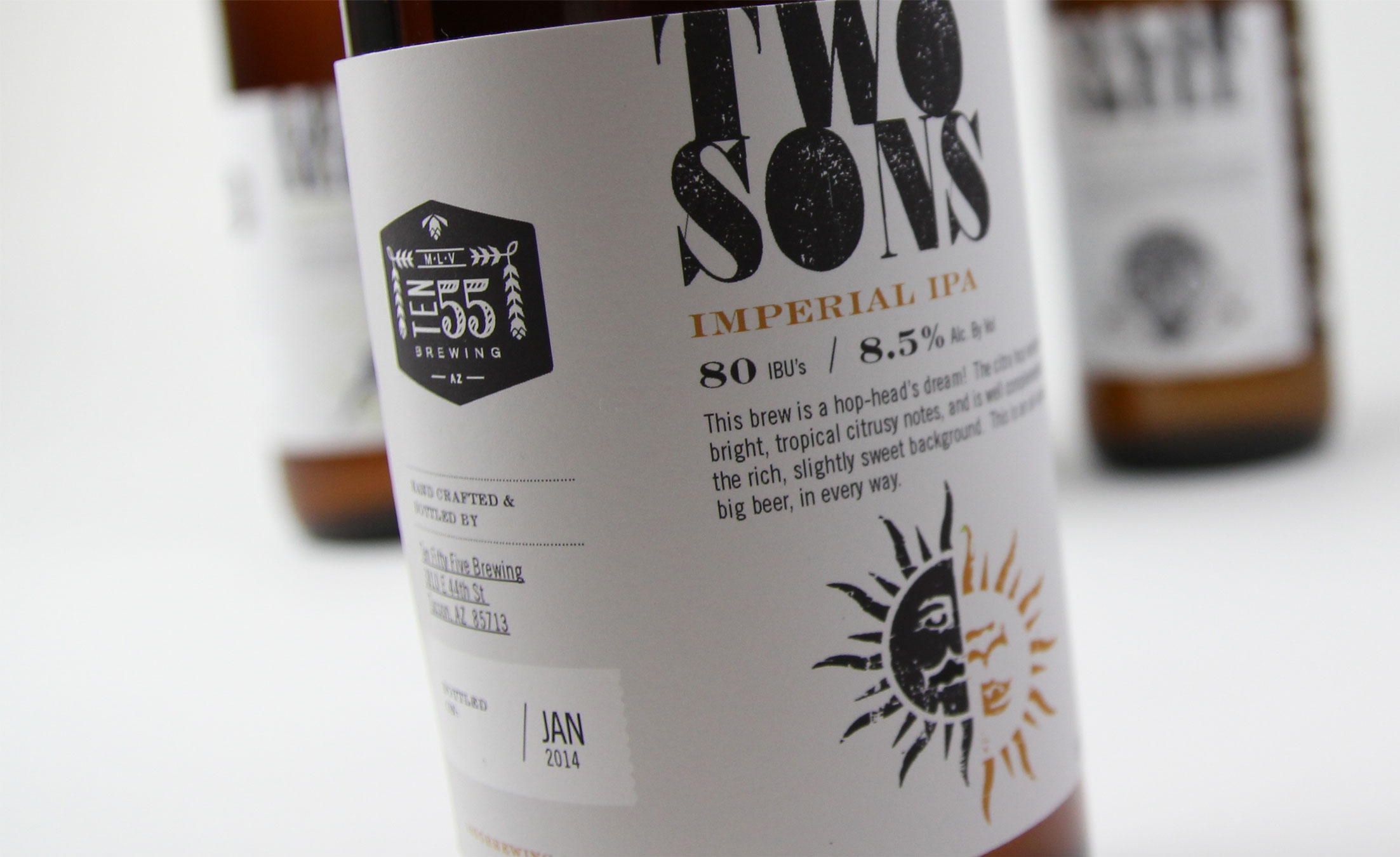
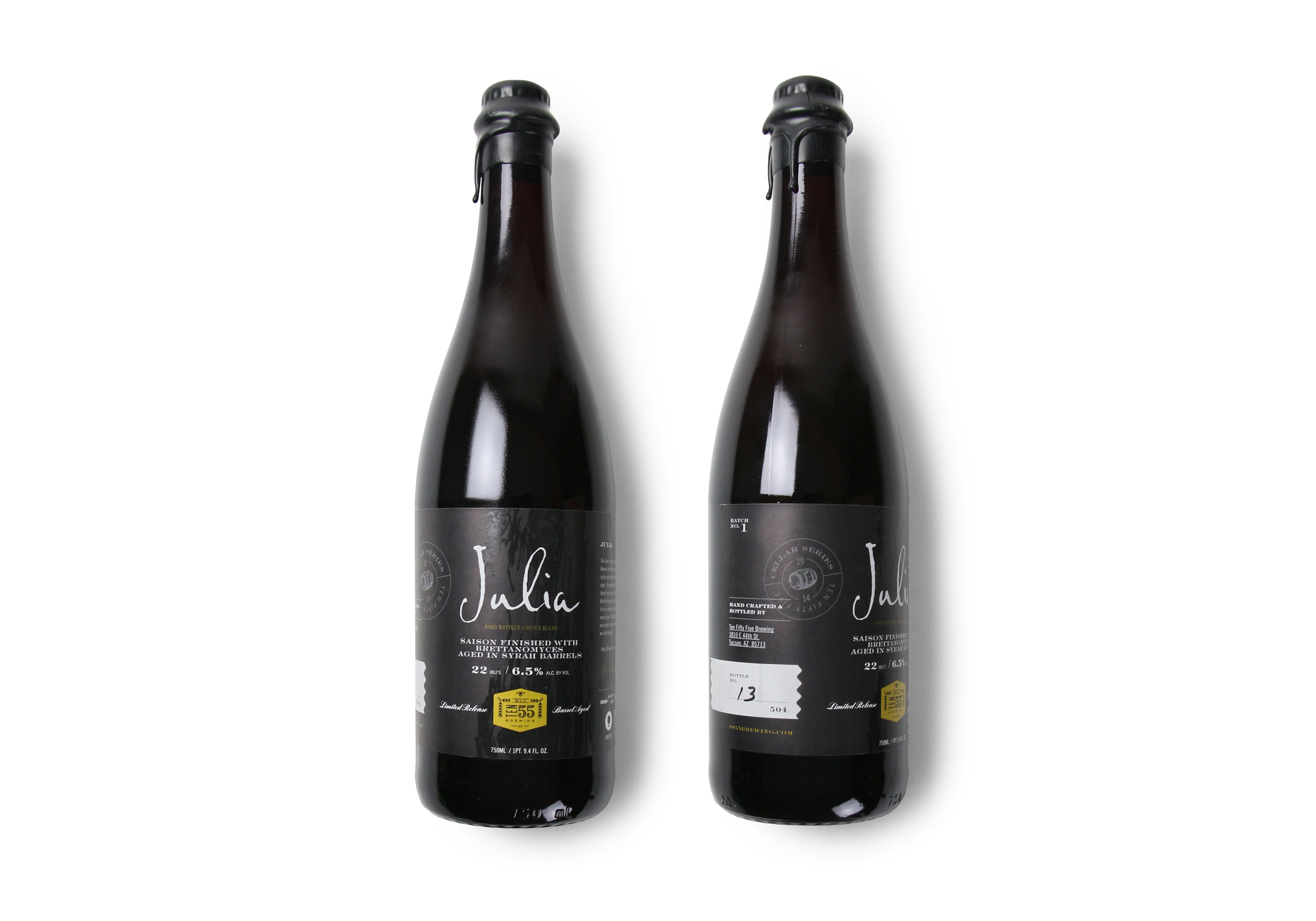
We reduced the visual clutter typically screen in the beer aisle and focused on creating a clean label that showcases what’s in the bottle and not what’s on the bottle.




More Projects

